 Famicom Dojo
 KEEP PLAYING
 KEEP PLAYING: Rewind
 Powet Toys
 Powetcast
 Hitchhiker's Guide POWETcast


X-Men Logo Study
by Crazy, filed in Comics on Nov.03, 2007
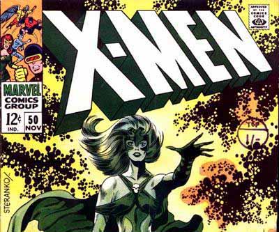
Did you know that the modern X-Men logo was originally designed by Jim Steranko and made its debut in X-Men 50 in November of 1968 (as seen in the above post banner)? In a surprisingly interesting series of articles, Todd Klein, who has done a wide variety of work as a letterer and designer, has assembled an exhaustive analysis of logos for the X-Men related books going as far back as issue 1 of X-Men from 1963. You can see his blog here and for the specific articles, see the direct links below.
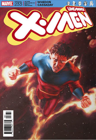
Part 9 was particularly interesting because it shows the most recent iteration of the X-Men logo and many of the other designs that were submitted with it all mocked up on the same cover for issue 233 (I suspect this is just filler numbering and lettering because we are currently only on issue 203 at retail and Whedon and Cassaday have never been revealed as the creative team for X-Men that I am aware of. Not sure what the cover art is from or will be.) I kind of liked this one:
Throughout the series, Klein offers up glimpses of logo art samples that could have been. See below for an example of that for the X-Factor logo.
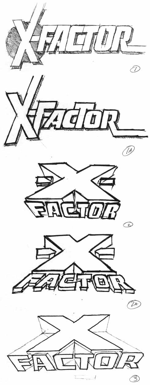
I should also note that Klein designed several X-Men related logos himself, including an X-Factor logo and an Excalibur logo. I found it interesting he noted in several places that when given a choice of logos, the editorial staff often chose the one closest resembling the original Steranko logo.
Part 1
Part 2
Part 3
Part 4
Part 5
Part 6
Part 7
Part 8
Part 9
Update
Let us know what you think in the comments!